Build 50 gave NOWEDGE a strong working structure. Friday’s pass was about making that structure calmer and more useful during an actual trading day.
The biggest change is simple: the information I reach for most no longer moves around when I open EDGE or switch schedule views.
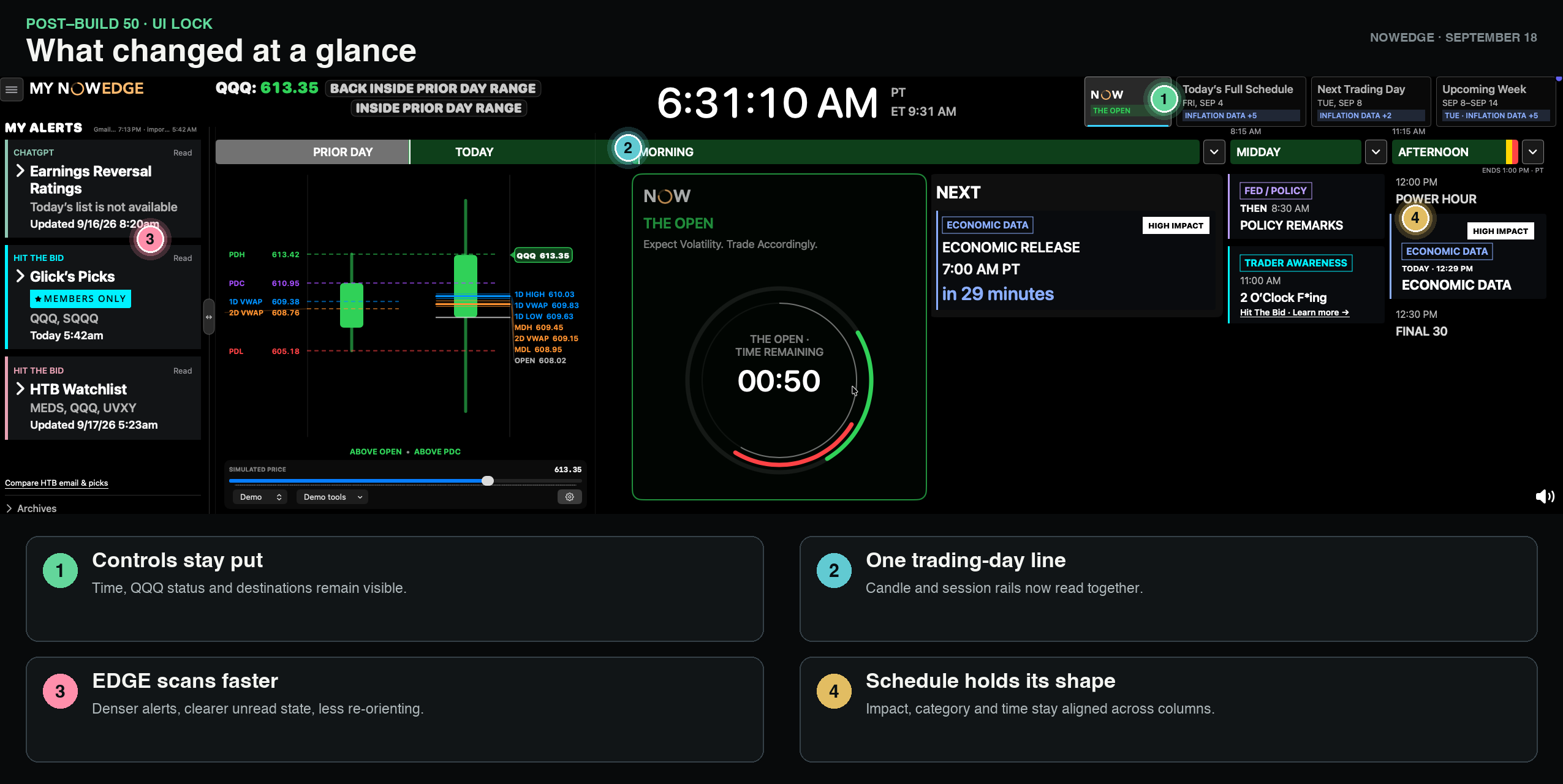
The best trading display gives you the answer without asking for your attention first.
The controls stay put
The top command bar now remains visible across the main dashboard, expanded EDGE and Full Schedule. The current time, QQQ status and four main destinations—NOW, Today’s Full Schedule, Next Trading Day and Upcoming Week—stay in the same place.
For a trader, that means less re-orienting after opening a deeper view. I can check the schedule or expand research without losing the clock or wondering how to get back to NOW.
The trading day reads as one line
The Candle’s Prior Day and Today sections now line up with the Event Horizon session rail. Today’s bar shows progress through the regular session, while the current position and remaining time stay connected to the same timeline.
When the market is closed, the Candle and schedule now agree about it. The display shifts into the darker closed-state treatment instead of letting an after-hours price update make the day look active again.
EDGE is faster to scan
EDGE now starts higher, keeps a useful minimum width and fits more into its cards without turning into a wall of text. A clearer MY ALERTS heading and stronger unread indicators make new research easier to spot.
The useful actions are still close by: source details, full analysis, the original email and members-only video links remain available when the source provides them.
The schedule holds its shape
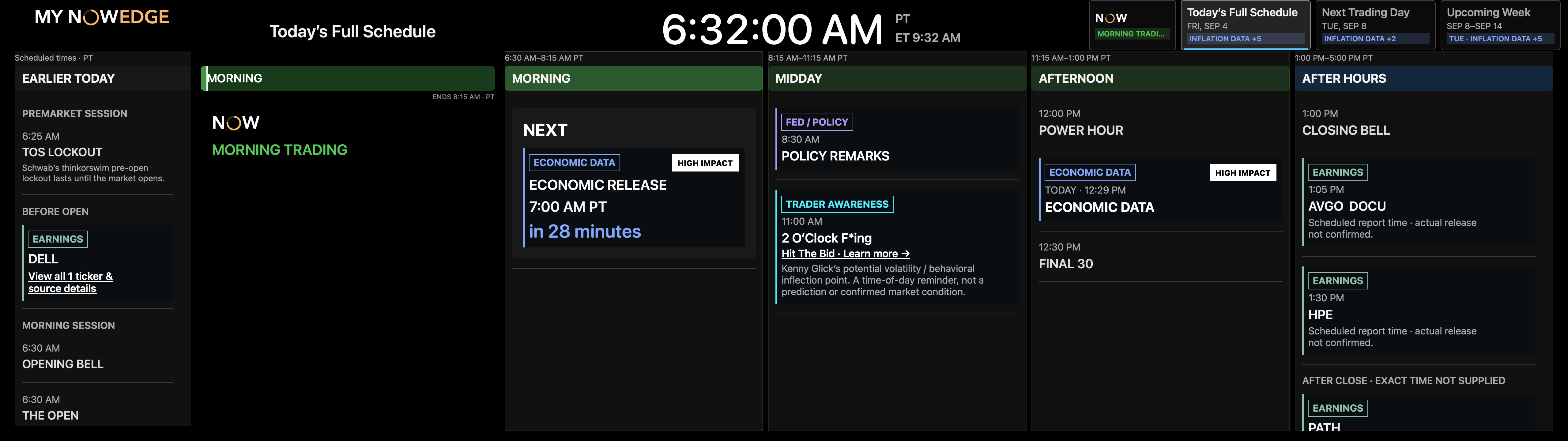
Calendar cards now reserve consistent space for the category, impact and time. Long labels no longer push HIGH IMPACT badges or timestamps out of alignment, so a busy day is easier to scan across columns.
Full Schedule also keeps the last completed session visible after the market has fully closed. That prevents the day’s rail from disappearing right when I may want to review what happened.
Where this pass started
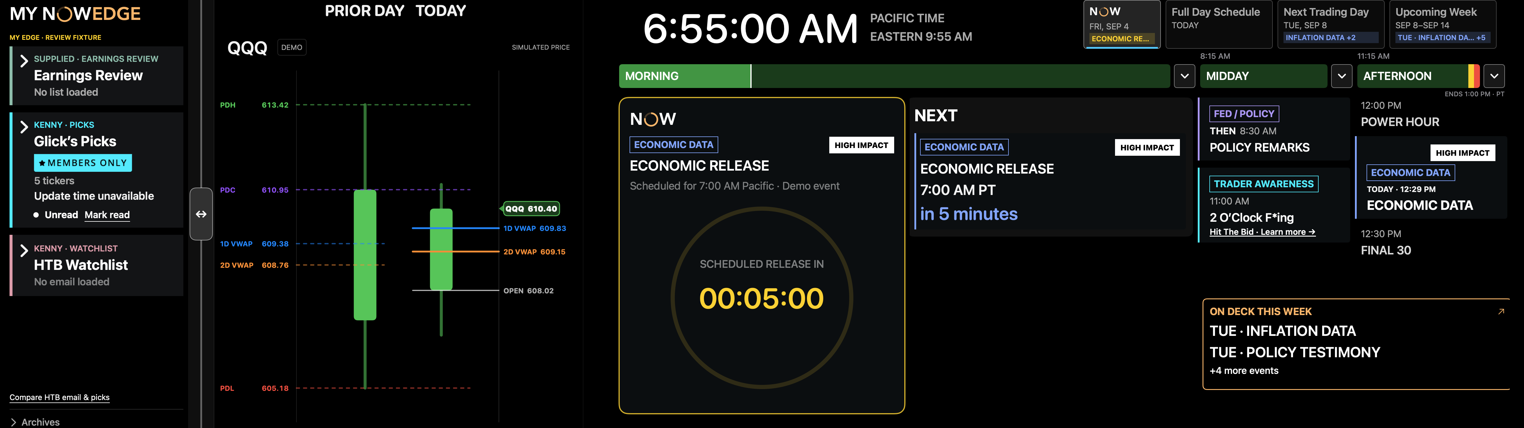
Build 50 established the working structure shown below. Keeping that earlier view here makes the progress easier to judge without asking readers to compare two dense screenshots before they know what changed.
One Candle pass remains separate
The Friday UI lock is the next accepted visual baseline after Build 50, but it is not a new stable release.
Embedded VWAP alert behavior still needs its own focused pass. I would rather review that carefully in live trading than squeeze it into a layout update.
A calmer screen can carry more useful context.
- Keep the clock, price context and navigation anchored while the rest of the view changes.
- Let progress, session state and calendar structure tell the same story.
- Denser can still feel calmer when labels, actions and alignment have clear jobs.
Trade with it, then tune the alerts.
- Use the accepted layout through more live sessions.
- Return to Candle alerts and VWAP behavior with the screen geometry locked.
Previous milestoneBuild 50 · accepted
Current UI baselineFriday UI lock · accepted and integrated into main
Stable releaseUnchanged